
UX/UI · Web Development
Turning an icon
into an experience.
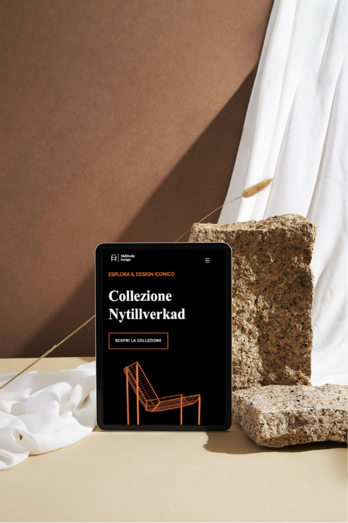
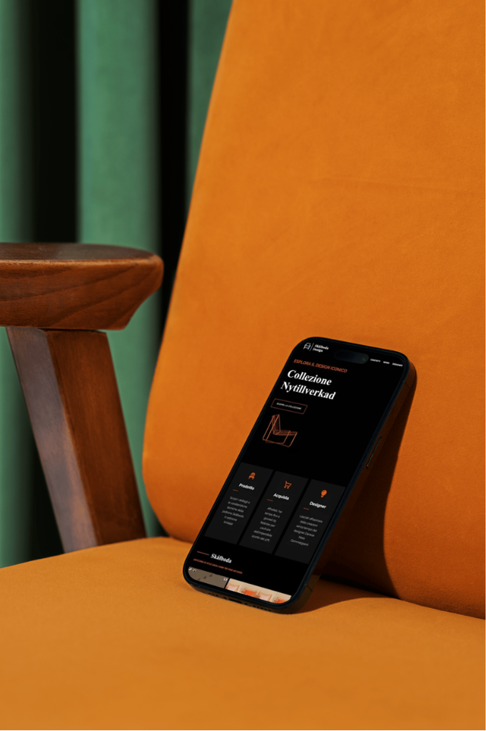
Designing a digital product experience for IKEA’s SKÅLBODA armchair, translating its distinctive character into a clear, engaging and functional web experience.

Client
University Project

Year
2024

Role
Interaction Designer · UX/UI Designer
SKÅLBODA is an IKEA armchair originally designed by Niels Gammelgaard in 1983 and later reintroduced as part of the Nytillverkad collection.
The project started from a simple brief: create a dedicated digital experience that could give the product greater visibility, communicate its qualities and encourage people to discover and purchase it.
Rather than treating the website as a collection of product information, the goal was to build an experience capable of translating the character of the chair into a digital environment while keeping product discovery simple and immediate.
⌁ The challenge
How can a digital experience make a product worth discovering?
A physical product can communicate through its shape, material and presence. Online, these qualities need to be translated into images, content, hierarchy and interaction. The challenge was to create a product page that could capture attention, communicate the identity of SKÅLBODA and guide people towards purchase without overwhelming the product itself.
PRODUCT
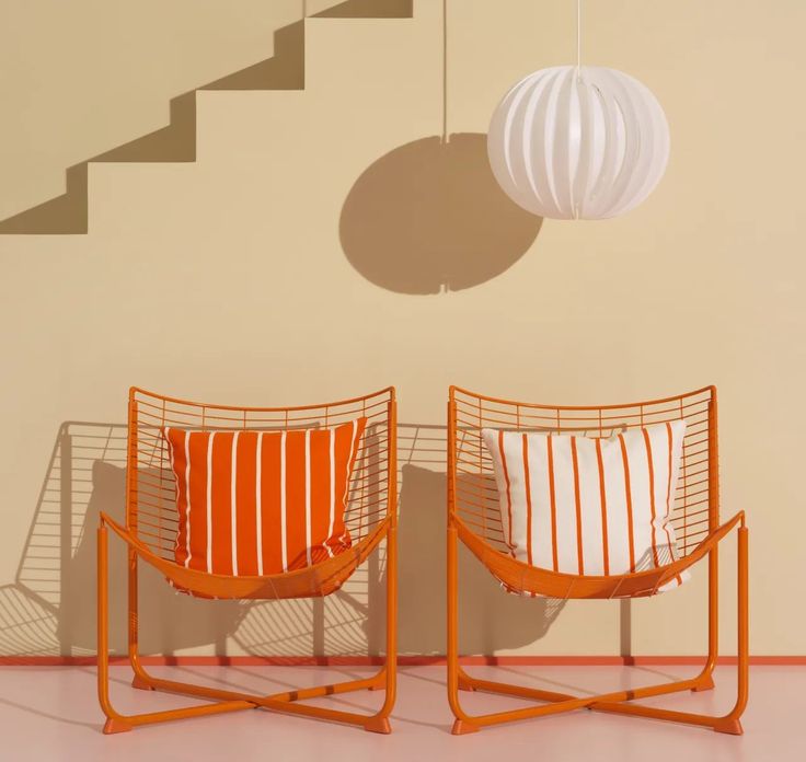
01 — Putting the design first
The chair needed to remain the protagonist, with the interface supporting its distinctive form, history and character.
EXPERIENCE
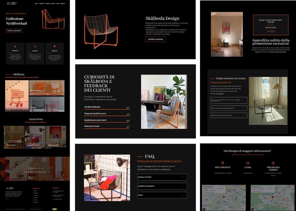
02 — Making discovery intuitive
Product information needed to be organised into a clear experience that could move naturally from discovery to understanding and, ultimately, purchase.
⌁ THE APPROACH
Starting with the product
Product research · IKEA benchmark · Competitor analysis · Content analysis
I started by looking at the product itself and at the way IKEA and other brands communicate furniture through digital experiences.
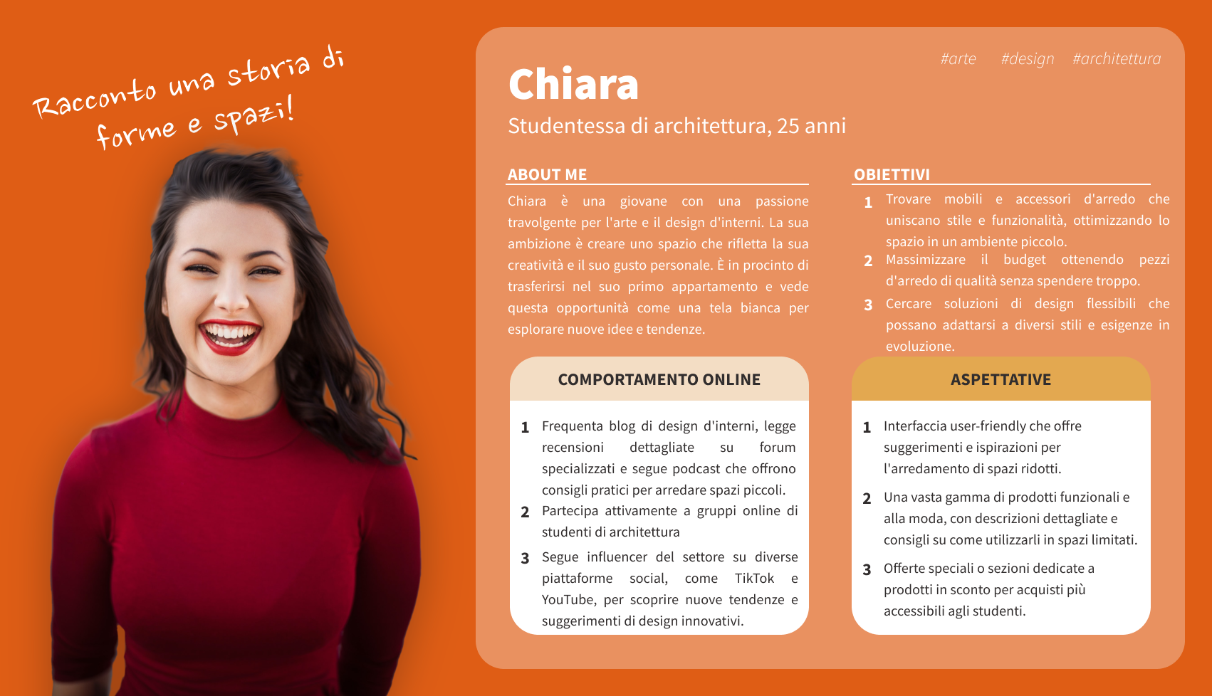
The analysis helped identify which information was most relevant, how similar products were presented and which elements could support both product storytelling and purchase decisions. These insights also helped define the user personas and their user journeys, creating a clearer understanding of expectations, behaviours and the information users would need throughout the experience.
The objective became finding the right balance between desirability, useful information and ease of discovery.
⌁ Defining the experience
What does the product need to say?
Personas · User journeys · Content Mapping · Information Architecture
Once the content and user perspective were defined, I worked on the information architecture and hierarchy of the experience.
The information architecture helped establish what users should encounter first, which details needed more space and how the different pieces of product information could progressively support discovery.
Content was then organised into a hierarchy that allowed the visual identity of SKÅLBODA to remain prominent while keeping relevant information easy to reach.
This created a clear relationship between visual discovery, product understanding and action.
⌁ Designing the experience
From product identity to interface
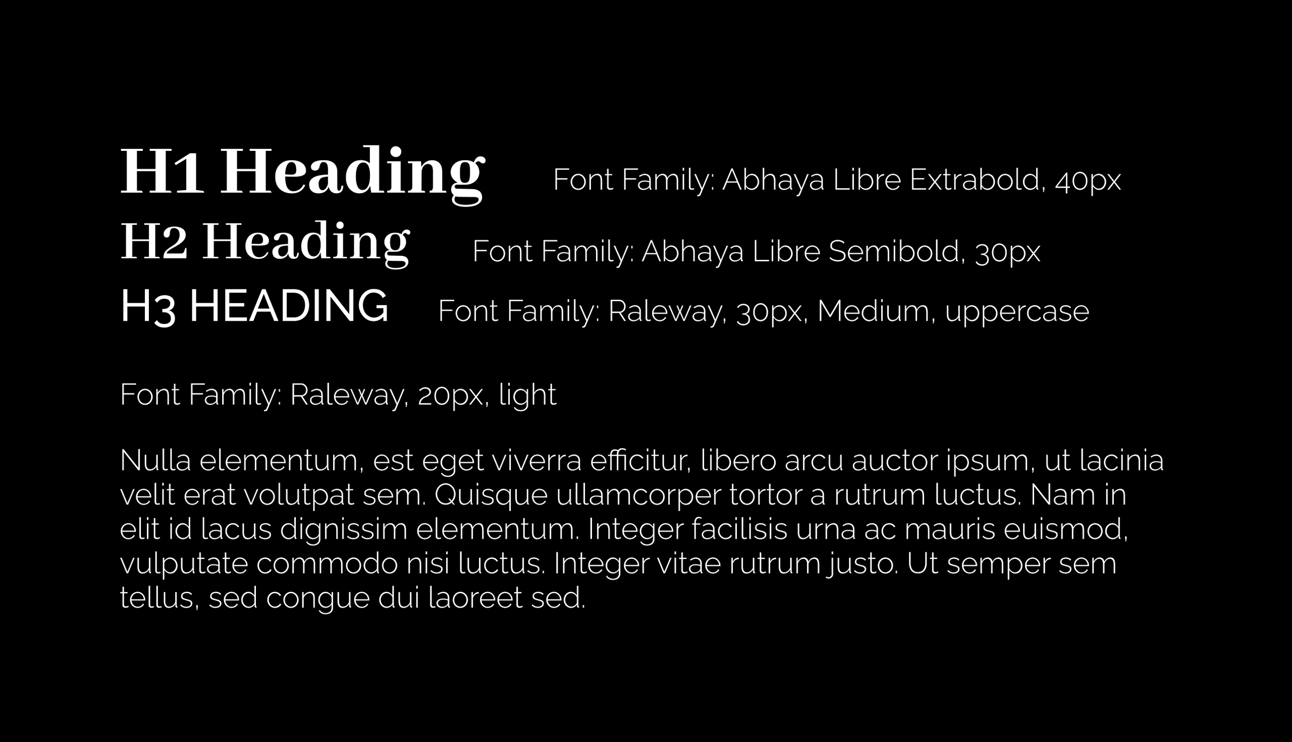
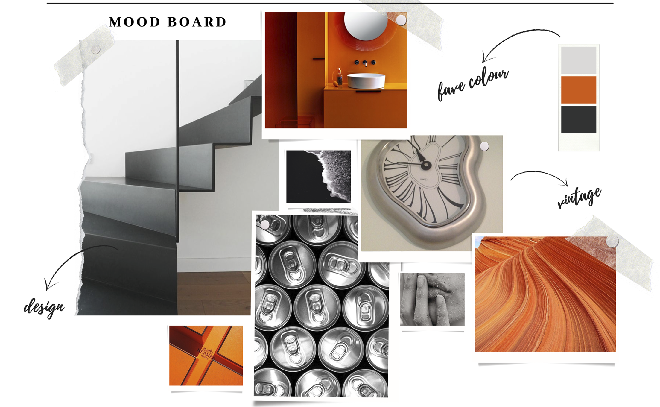
Moodboard · Art direction · Typography · Sketching · Wireframing · UI Design · Design System
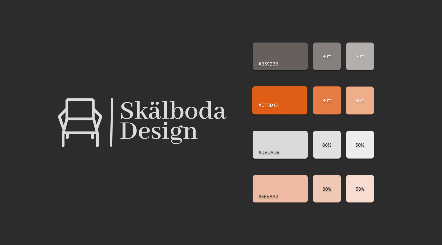
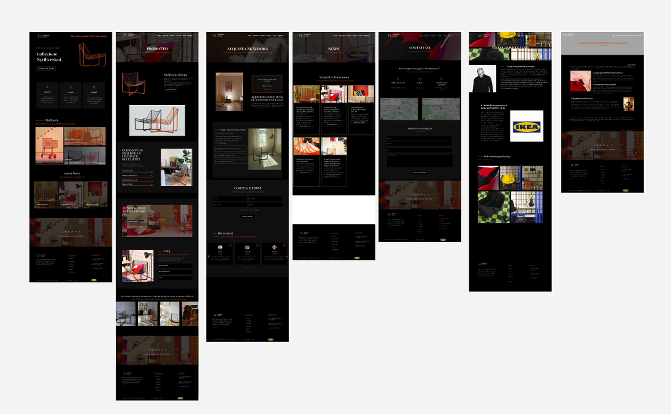
The visual direction started with an exploration of colour, typography and references inspired by the character of SKÅLBODA. This direction was more colourful, but through iteration the interface evolved towards a dark visual environment with orange as an accent colour.
Reducing the palette created a more focused visual language and allowed the chair to become the strongest element on the page.
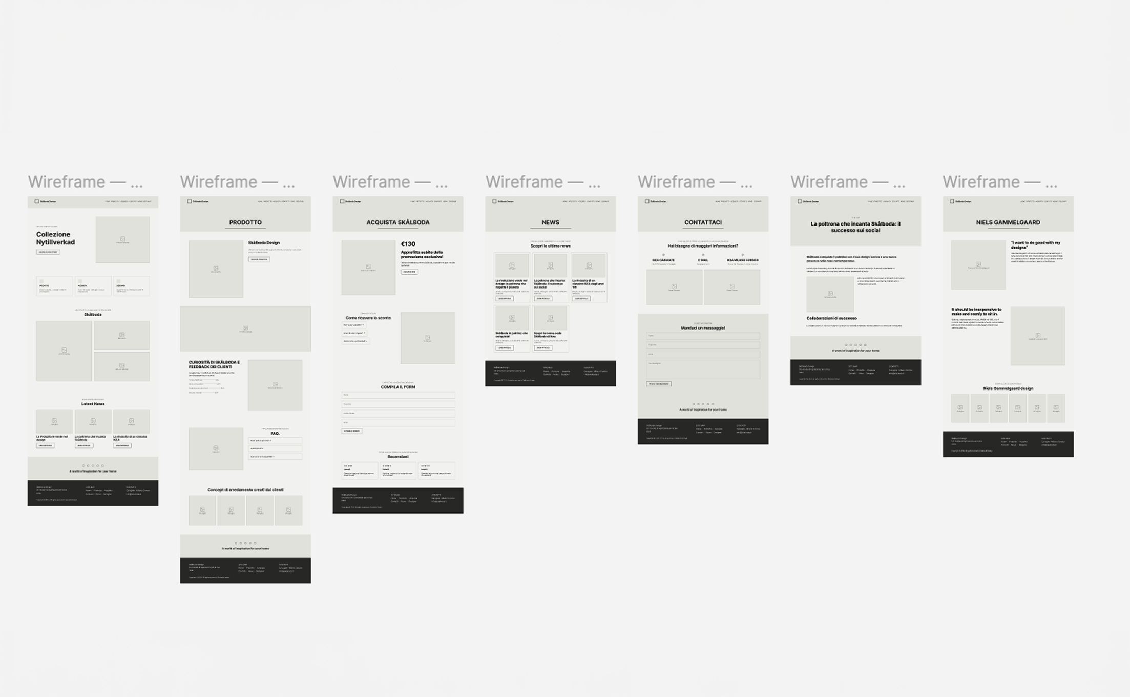
From initial sketches, I moved into wireframes and progressively developed the interface, defining typography, spacing, components and interaction patterns.
The final UI was supported by a small design system to maintain visual and functional consistency throughout the experience.
Once the experience was defined, the website was also developed in WordPress, bringing the project from design to a functional responsive implementation.
⌁ Testing and iteration
Does every interaction feel clear?
Cognitive Walkthrough · Heuristic Evaluation · Iteration
Before finalising the experience, I evaluated the interface from both a user and an expert perspective.
Through a Cognitive Walkthrough, I stepped through the main user tasks from the perspective of someone encountering the interface for the first time, checking whether each action was visible, understandable and produced the expected feedback.
I then conducted a Heuristic Evaluation using Nielsen’s 10 usability heuristics, examining aspects such as system feedback, consistency, user control, error prevention and recognition over recall.
The evaluations highlighted areas where navigation, hierarchy and interaction could be clarified. These findings informed the final iterations, allowing the experience to become more coherent, predictable and easy to navigate before implementation.
⌁ Outcome
A digital space for the product
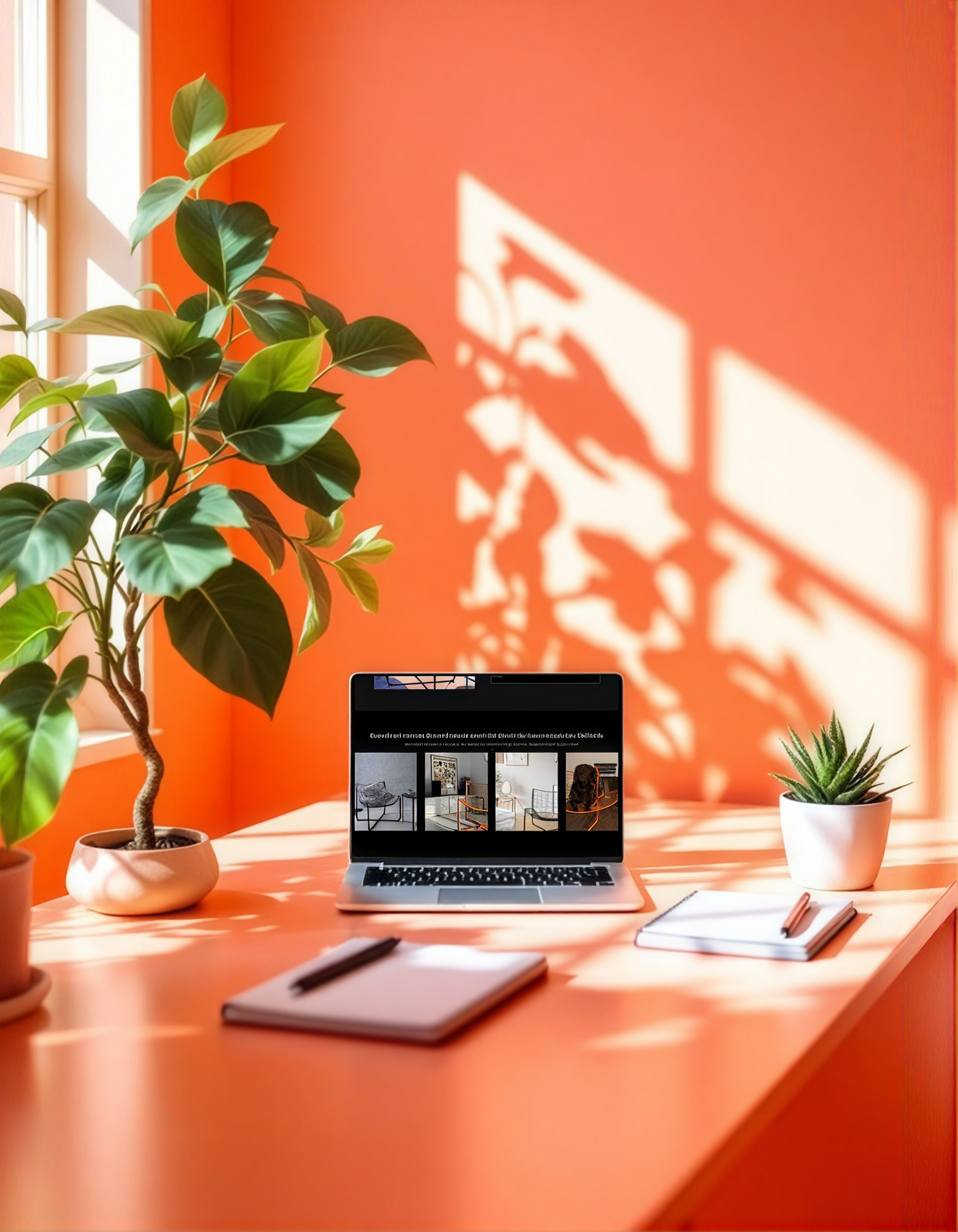
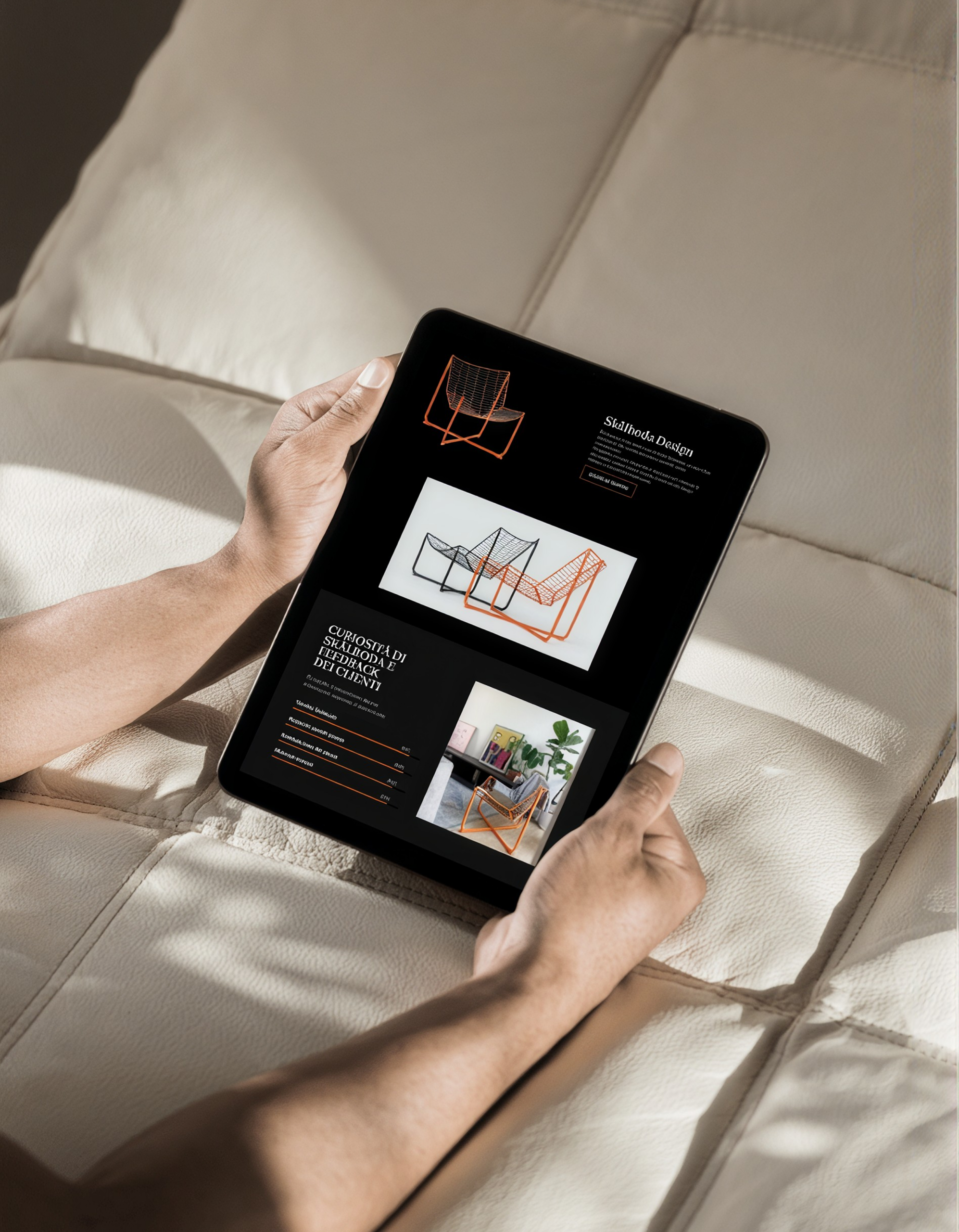
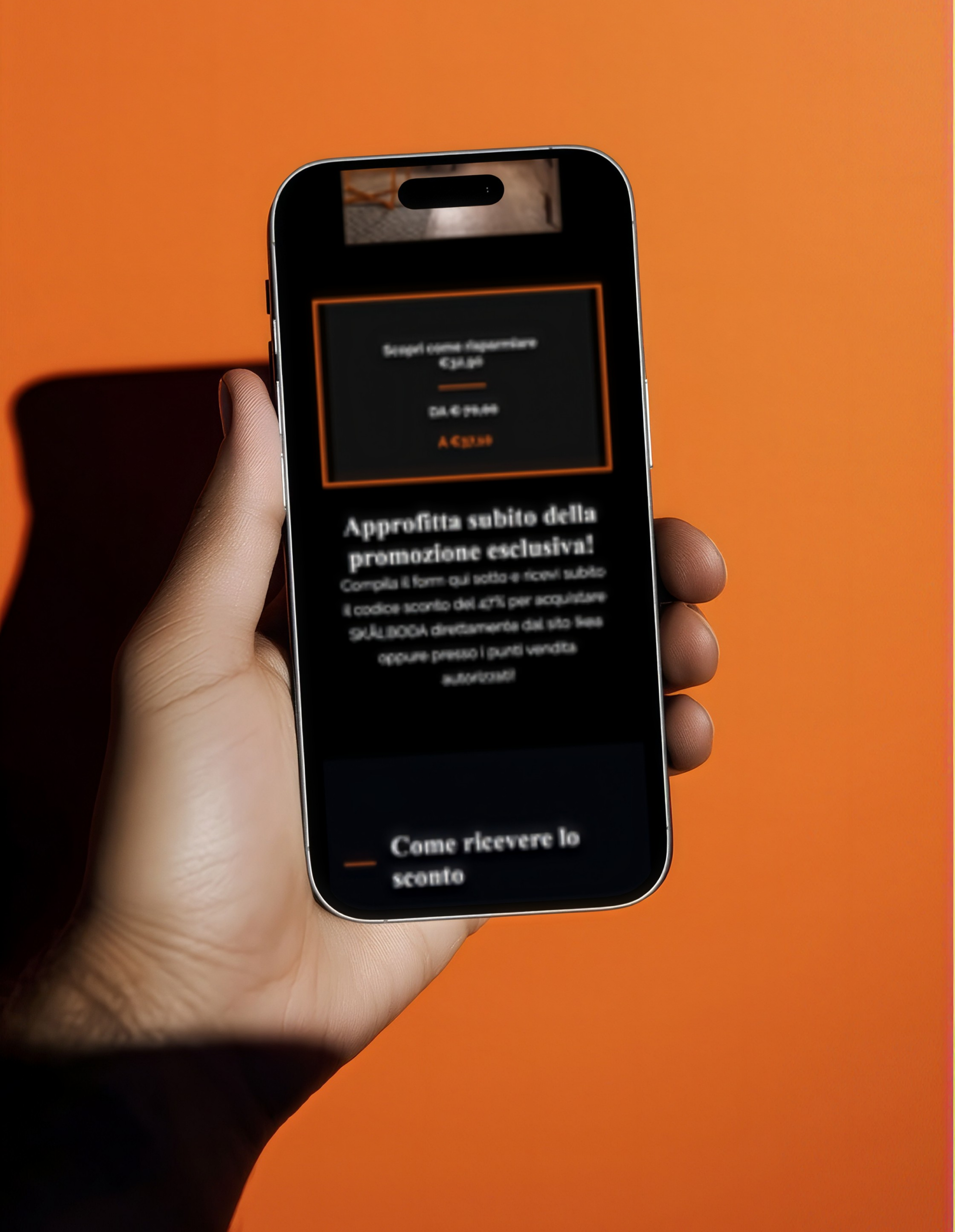
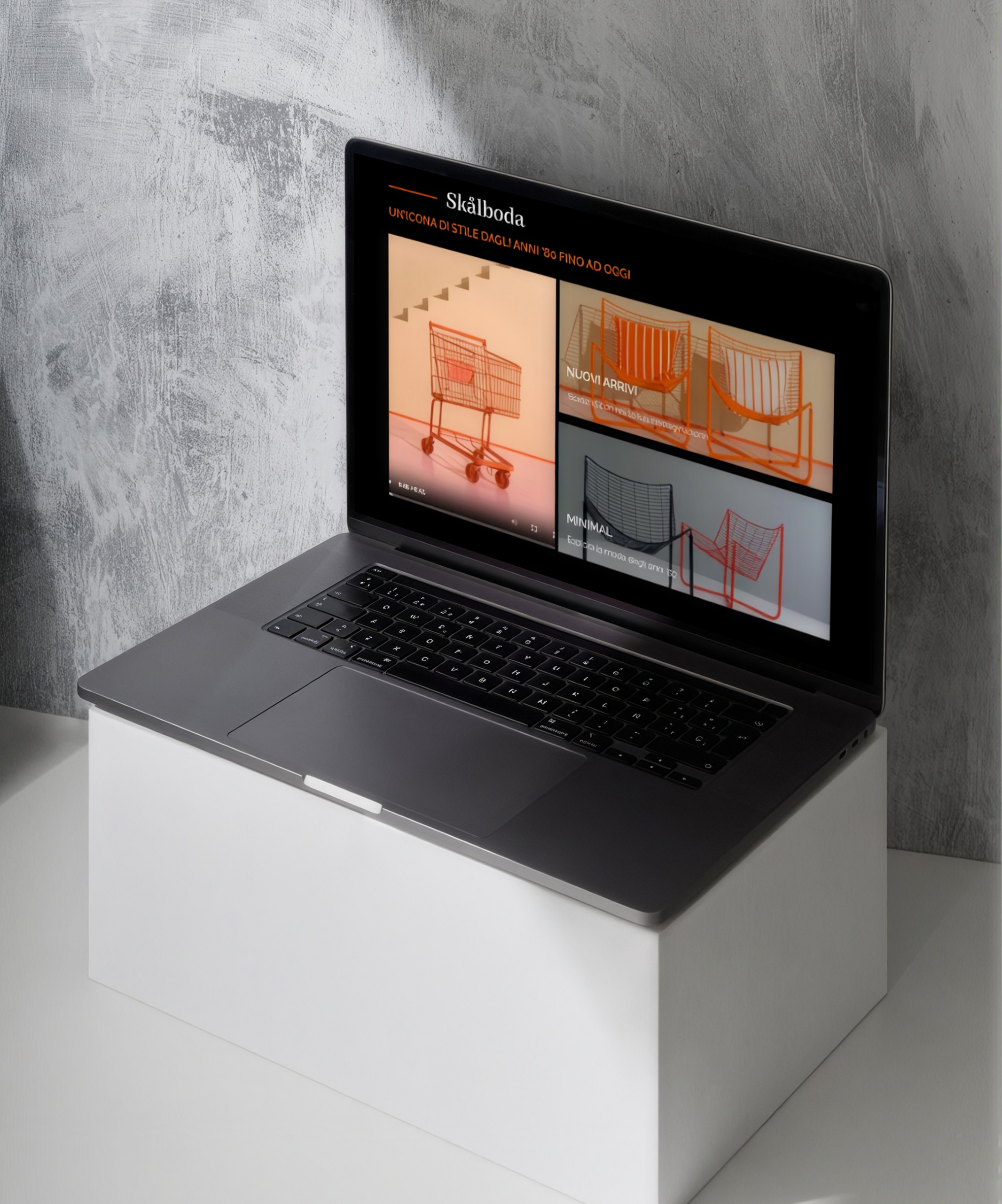
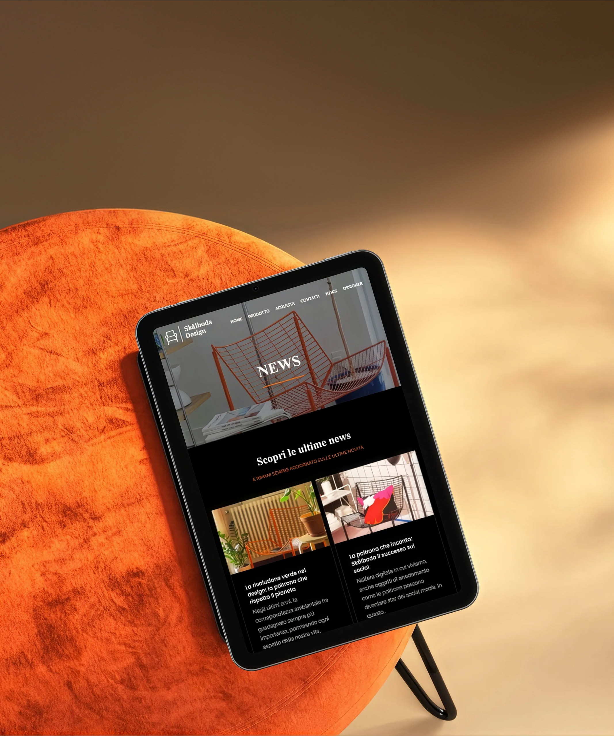
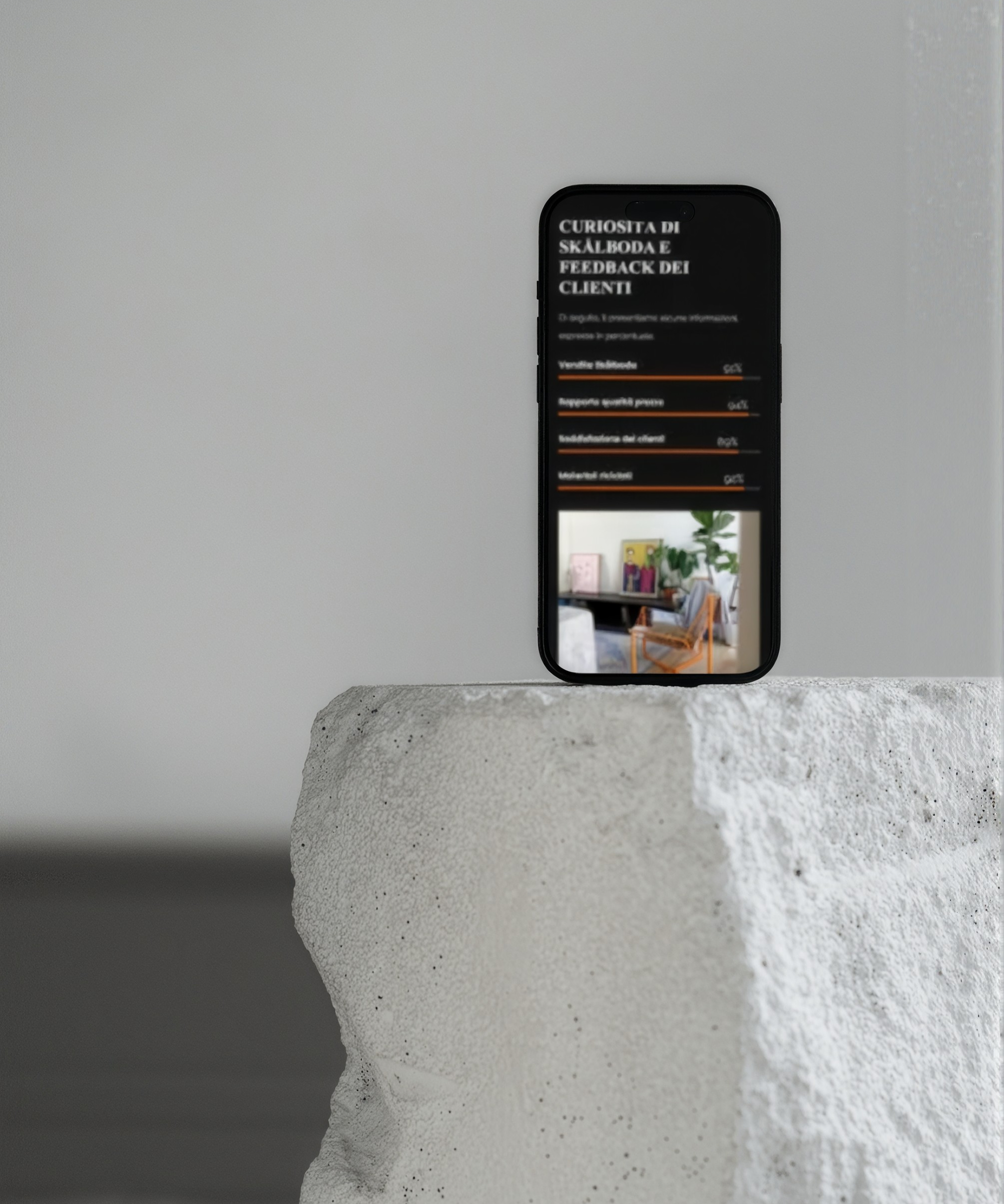
The final result is a responsive digital experience designed to give SKÅLBODA its own space to be discovered.
The project combines UX, interaction and visual design with a functional WordPress implementation, taking the experience from product research and information architecture to the final interface and development.
The result keeps the chair at the centre while creating a clear path between discovery, understanding and purchase.
⌁ TAKEAWAY
Design should know when to step back
SKÅLBODA reinforced the importance of designing around what already makes a product distinctive.
When the product has a strong visual identity, the interface does not need to compete with it. Its role is to create the right context for people to discover it, understand it and take the next step.
The project also gave me the opportunity to move beyond the interface itself, translating the design into a fully developed digital experience.
⌁ NEW CONNECTIONS
Let’s create something
useful
Every project starts with a question, a conversation, or simply the curiosity to see what could be done differently.
Have an idea, a project, or just something you’d like to talk about?