
UX/UI · WordPress
A historic place,
reimagined online.
Designing a digital experience for La Ca’ del Hül, from information architecture
to a fully responsive WordPress website.

Client
La Ca’ del Hül

Year
2026

Role
UX/UI Designer · WordPress Developer
La Ca’ del Hul is a holiday home located in the Valle Camonica, surrounded by nature and connected to the history of the area.
When I started the project, the property did not have its own website. The goal was to create a digital touchpoint where people could discover the house, its history, rooms, services and surroundings, and then get in touch with the owners to ask for information or make a booking.
I managed the project independently, from the initial research and content organisation to UX/UI design, responsive design and WordPress development.
⌁ The challenge
How can a digital experience preserve the character of a place?
The project had to balance two different needs: making the website contemporary and easy to navigate, while preserving the historical and authentic character of the house.
At the same time, the website needed to bring together very different types of information — from the history of the property and rooms to services, activities, location, prices and contact details — without making the experience feel overwhelming.
HERITAGE
01 — Keeping the story at the centre
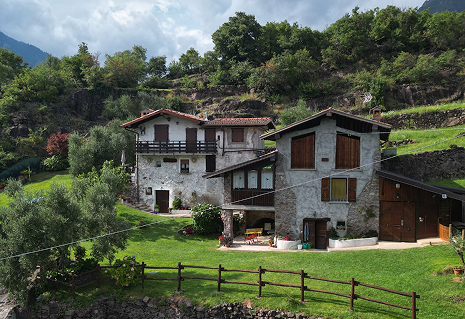
The house’s history, architecture and connection to the territory needed to become part of the digital experience rather than simply background information.
Digital Experience
02 — Making discovery simple
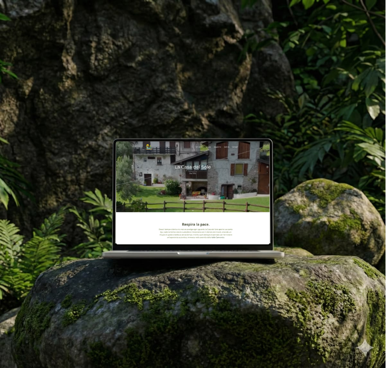
The website needed to organise a large amount of content and photography into a clear, intuitive experience that could guide visitors naturally towards getting in touch.
⌁ THE APPROACH
Understanding the place before designing the interface
Competitor analysis · Benchmark · Client interview · Content research
I started by looking at how similar holiday homes and accommodation businesses communicate online. I analysed competitor websites, benchmarks and visual references to understand how information such as rooms, services, location and booking details could be presented.
I then worked directly with the owner to understand the structure of the property, the available content and the needs behind the website. Looking at the questions and requests received from guests also helped identify which information needed to be immediately accessible.
This research gave me the foundations for defining both the content structure and the overall direction of the experience.
⌁ Defining the structure
How do you organise a place people need to discover?
Information architecture · Content organisation · Card sorting · User flows
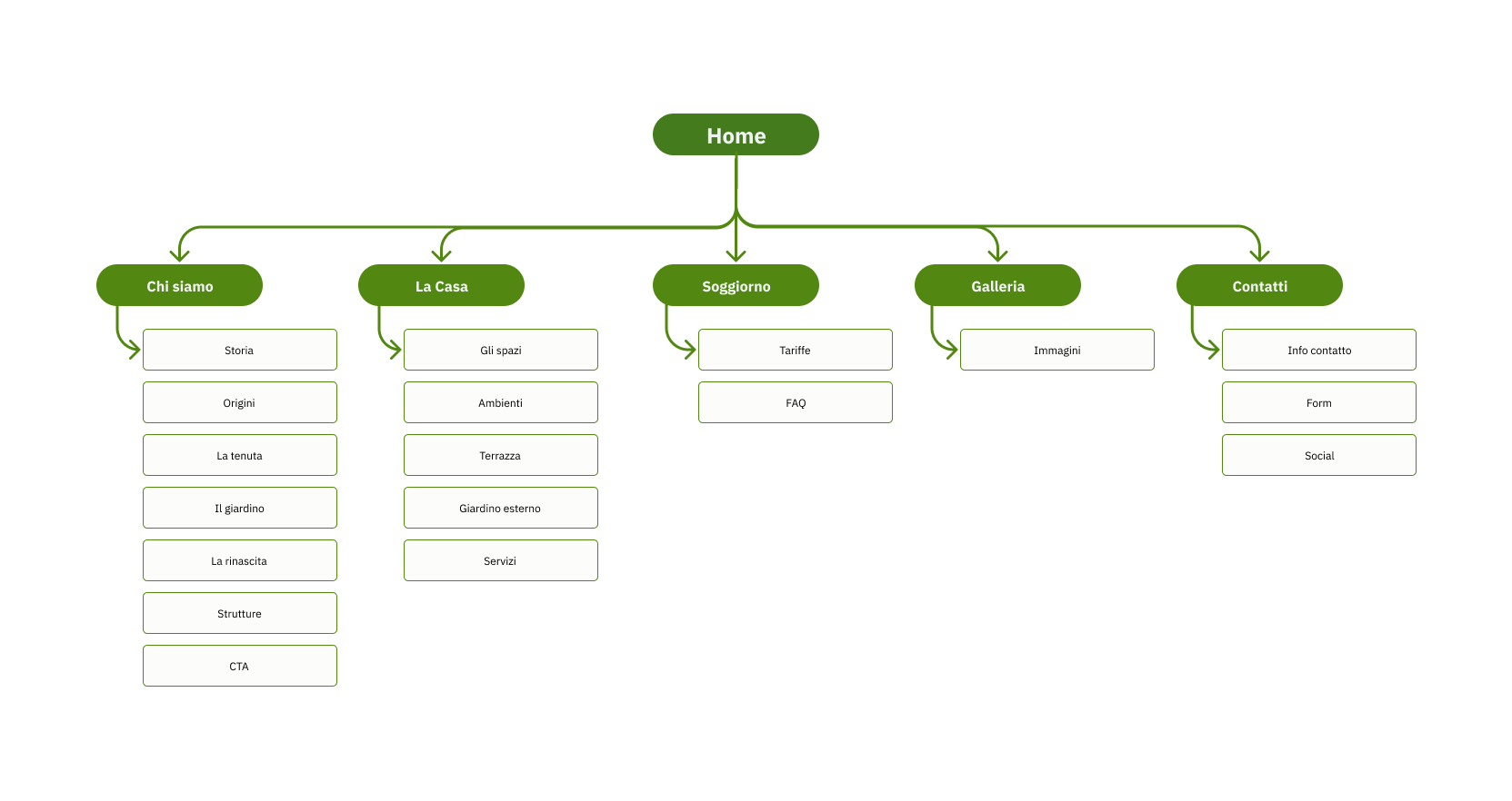
Before moving into visual design, I focused on the information architecture.
The owner had an initial mental model of how the property and its information were organised. I used this as a starting point and translated it into a clearer digital structure, grouping content according to what visitors would actually want to discover.
The final structure brought together Home, About, The House, Stay, Gallery and Contact, creating a simple path from discovering the property to understanding the experience and eventually getting in touch.
I also mapped the different types of content — from practical information to storytelling — so that each had a clear place within the website.
From structure to experience
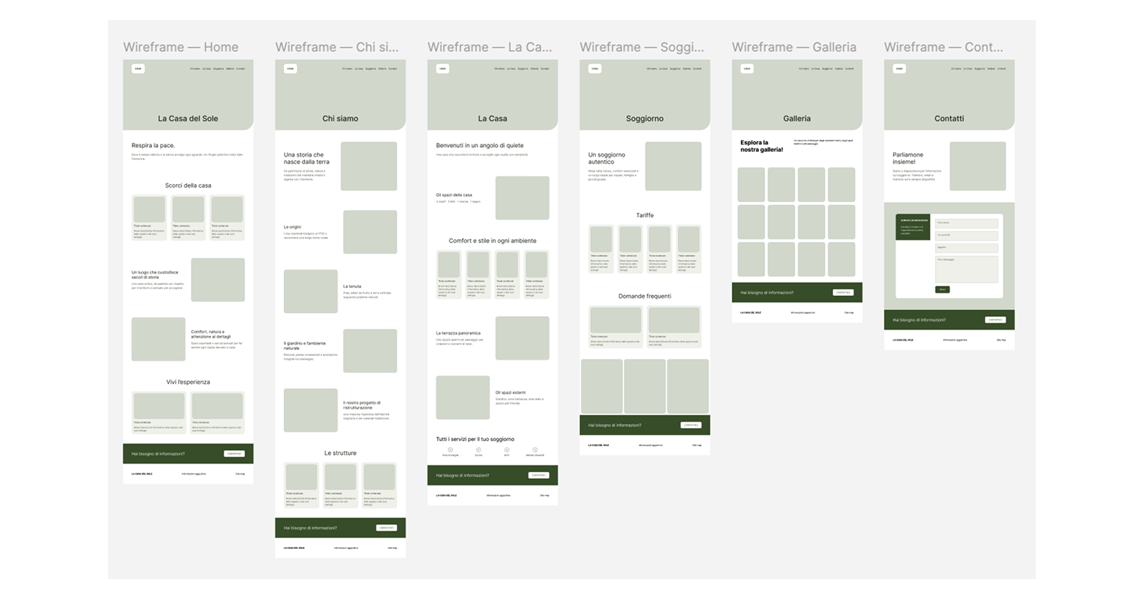
I began exploring the website through hand-drawn sketches and low-fidelity wireframes, using them to define the main sections and hierarchy of each page before moving into the visual design.
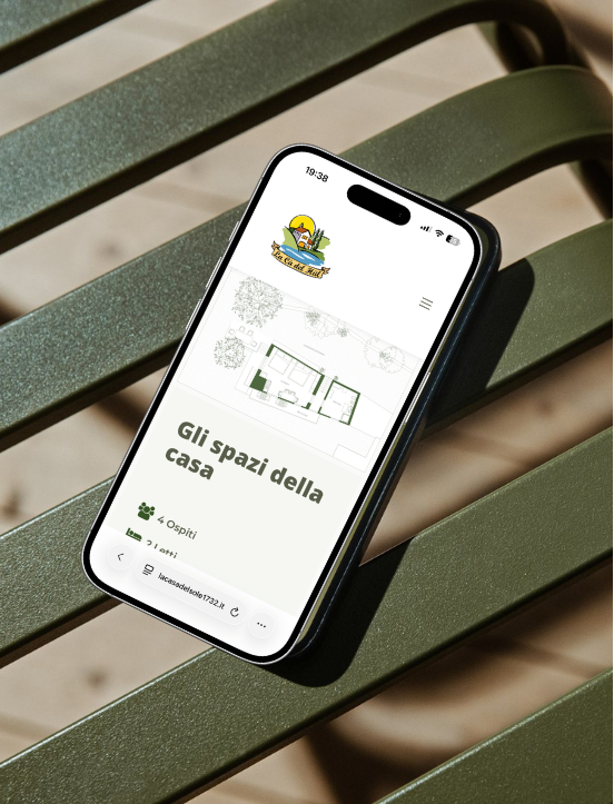
A key part of the process was deciding how to work with the large amount of available photography. Historical photographs, contemporary images, maps and the house plan were not treated simply as decorative assets: they became part of the storytelling and helped users understand the place.
The visual direction therefore needed to feel contemporary, natural and bold, while still reflecting the history and atmosphere of the property.
⌁ Designing the interface
How can the website feel contemporary without losing its character?
Sketching · Wireframing · UI Design · Design System · Responsive Design
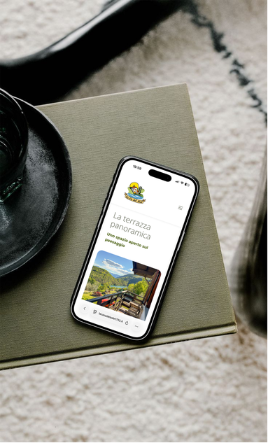
I translated the structure into a responsive interface designed with a mobile-first approach.
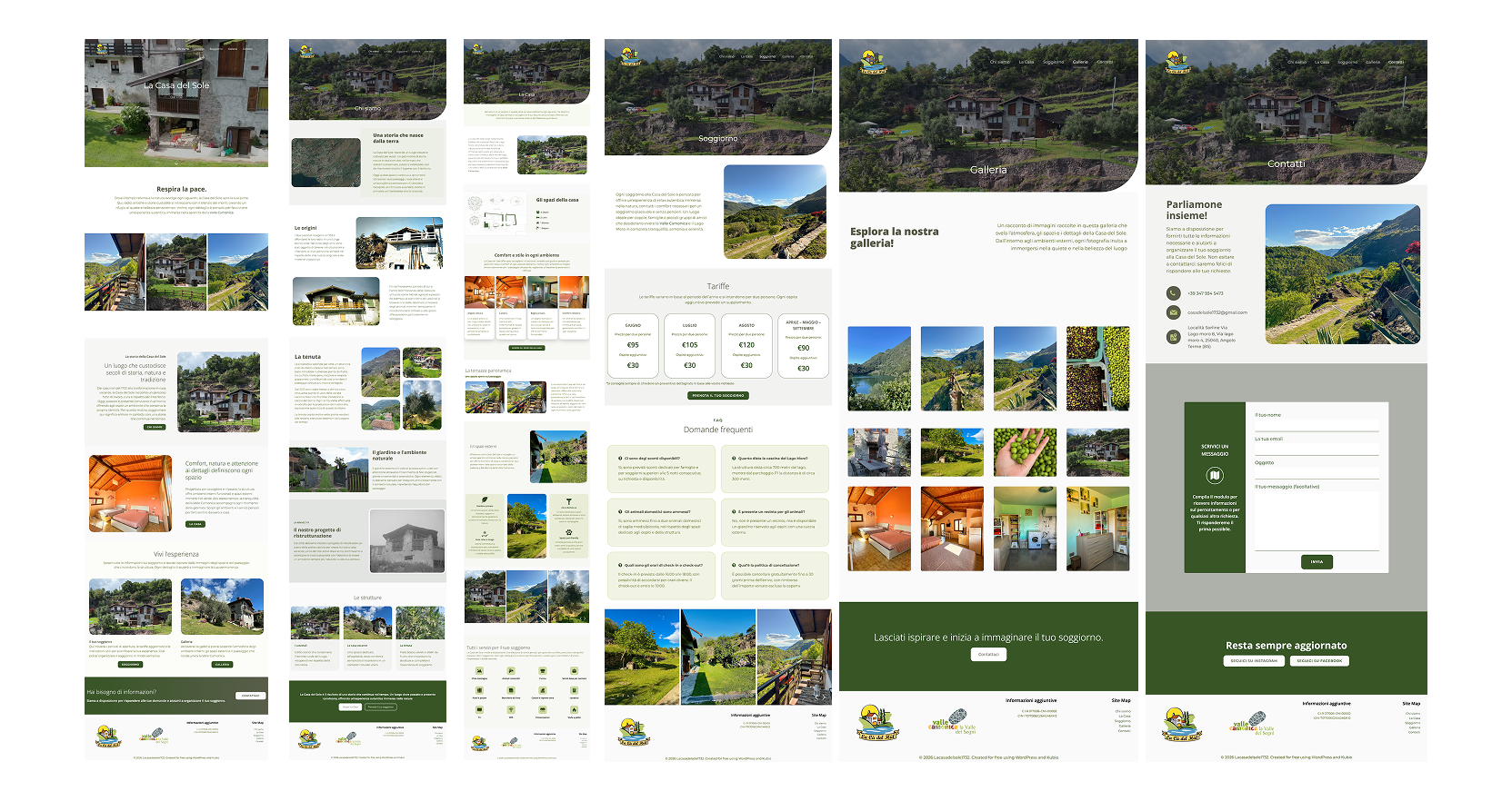
The visual system was built around the existing identity of the property, reinforcing it through typography, colour, spacing and layout rather than replacing it with a completely new visual language. I developed the UI and created a small design system to keep components, typography and interactions consistent across the different pages.
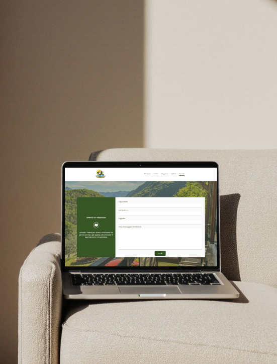
The contact experience was also designed as a natural continuation of the journey, with clear calls to action leading to a form where visitors could provide their details, explain their request and get in touch with the owners.
From Figma to WordPress
Figma · WordPress · Responsive development · Content implementation
The project also involved bringing the design into a real website. Because WordPress was part of the project constraints, I adapted the design to the chosen environment and then developed and customised the website directly within WordPress.
This required balancing the freedom of the visual concept with the possibilities and limitations of the platform, while making sure that the final result remained responsive, coherent and easy for the client to manage.
⌁ Testing and iteration
Does the structure make sense to someone who doesn’t know the house?
Informal usability testing · Observation · Feedback · Iteration
Before finalising the experience, I carried out small informal tests with potential users and acquaintances.
Rather than testing isolated visual details, I used these sessions to observe whether people could understand the structure of the website, find the information they expected and move naturally between the different sections.
The feedback helped me refine the organisation of information, clarify navigation and make some content easier to reach. This final step allowed me to validate the structure from an external perspective and make adjustments before publishing the website.
⌁ Outcome
A digital home for a real place
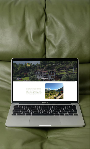
The result is a responsive website that brings together the story of La Ca’ del Hül, its spaces, services, surroundings and practical information in one coherent digital experience.
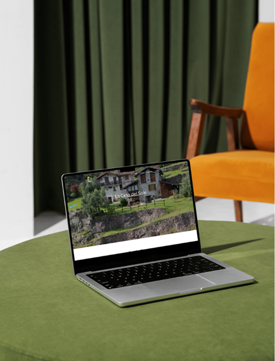
The website was published and is now used by the client as a real touchpoint for people interested in staying at the property or requesting more information.
For me, the project meant managing the complete design process independently — from understanding the client’s needs and organising content to designing the experience, building the interface and developing the final website in WordPress.
⌁ TAKEAWAY
Designing with the place, not just for it
This project taught me how much UX work can happen before a single interface is designed.
The biggest challenge was not creating a visually appealing website, but finding the right balance between storytelling, usability, content and the identity of a real place.
Working directly with the client also meant making design decisions within real constraints, adapting the process as new information emerged and taking responsibility for the project all the way from the first idea to the published website.
⌁ TASTE THE PROJECT
See a place come
to life online
Explore how the history, spaces and identity of La Ca’ del Hül
were translated into a digital experience.